Onboarding Best Practices for Consumer Apps: What Gaming Learned a Decade Ago
Most apps lose 77% of daily users within 3 days. Learn how gaming's FTUE playbook fixes consumer app onboarding, paywall timing, and D1 retention.
The average mobile app loses 77% of its daily active users (DAUs) within three days of install. Often, this churn isn’t caused by a missing feature or an unpolished settings menu. It’s an engineering failure within the first session.
When I advise consumer app teams on activation drop-offs, I constantly see two structural mistakes:
Monetizing before establishing value: Forcing users into a hard paywall or early scarcity state requires them to make a premature decision. They either need to become a "grinder" (harvesting low-value actions) or a paid subscriber - before they even understand the value of what they’re paying for.
Exposing the feature inventory immediately: Opening the entire application UI on the third screen that users see is confusing. When every tab, widget, and configuration option is visible at once, the core product loop gets lost in visual noise.
If you can’t identify the exact step in the first session where user drop-off occurs (and the specific micro-action left uncompleted before exit), you don’t have an onboarding problem yet. You have a measurement problem.
What gaming means by FTUE (and why it matters here)
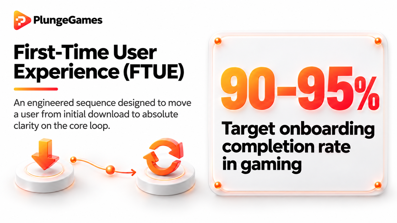
In free-to-play mobile gaming, First-Time User Experience (FTUE) is an engineered sequence designed to move a user from initial download to absolute clarity on the core loop. Gaming studios don’t view onboarding as a setup checklist; they target 90-95% completion rates before introducing the first hard gate or complex sub-system.
Consumer apps routinely fail this discipline because they mistake a guided feature tour for activation. Here’s how gaming approaches the FTUE and what consumer apps can take from these examples.
Core loop protection vs. feature overload
In gaming, auxiliary menus like guild systems, secondary inventories, and complex settings stay locked behind progression milestones. The user executes the primary action multiple times before any adjacent feature appears.
Consumer apps often do the exact opposite: they grant access to every tab on day one. A user opens a health tracking app and is simultaneously shown workout routines, social feeds, macro calculators, and subscription banners. Without a protected core loop, cognitive fatigue sets in, time-to-value dilutes, and the user ends their first session without a clear reason to return.
Defining the real "aha moment"
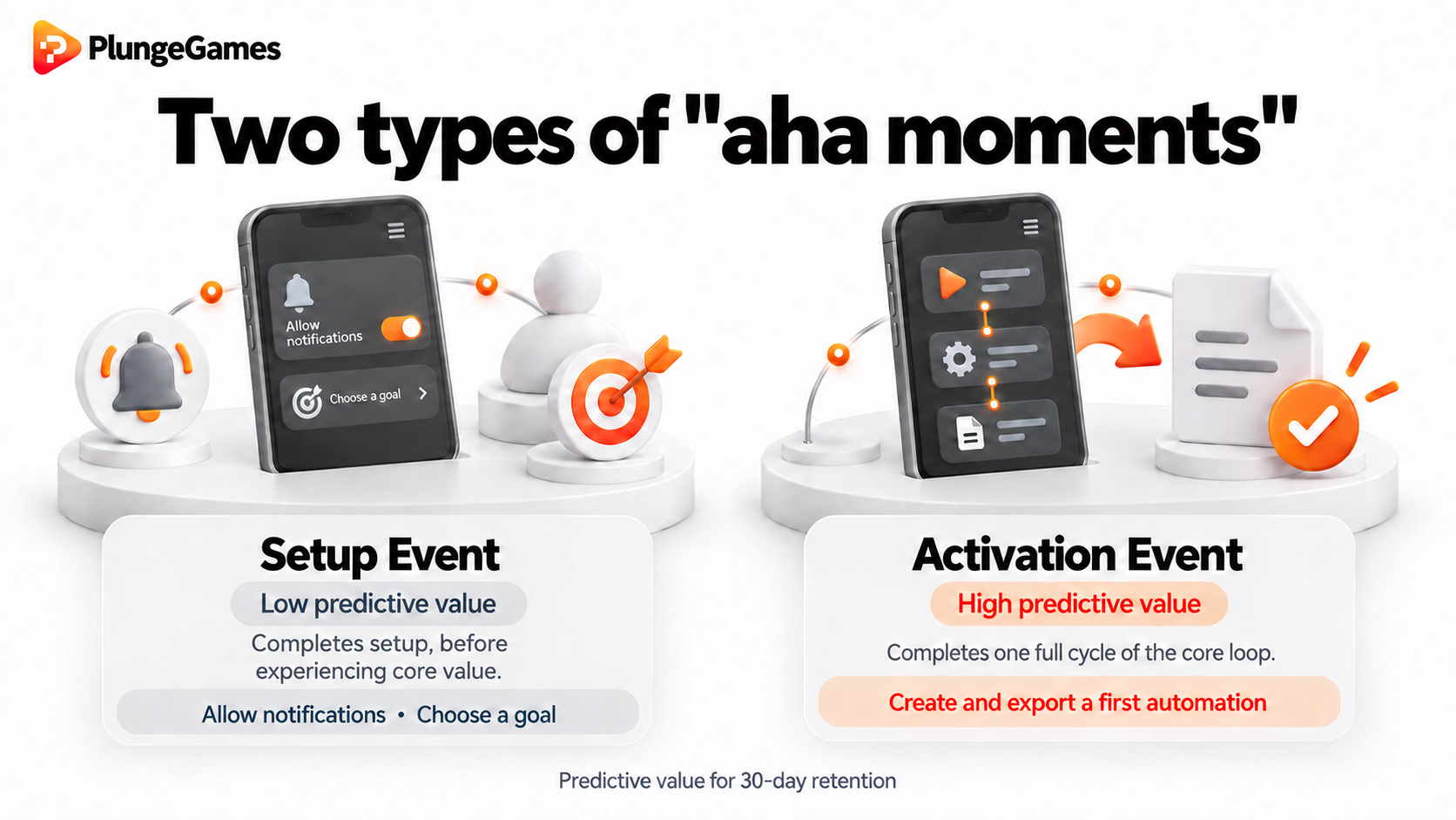
Completing a setup wizard or dismissing a tooltip isn’t activation. The real 'aha moment' is the precise action that correlates with 30-day retention.
Setup Event (low predictive value): User grants notification permissions and selects a profile goal.
Activation Event (high predictive value): User completes one full cycle of the core loop (e.g., creating and exporting their first 10-second automation, logging a single workout set, or executing a core workflow).
Audit your D1 screen state. If your navigation bar exposes four or five distinct sections during the first session, remove three of them. Hide secondary features behind a primary activation trigger (e.g., unlock the "Analytics" tab only after the user executes the primary action twice). And track D1 retention against core loop completion rather than tutorial completion.
The paywall timing problem
Most consumer apps place the paywall where the designer felt it belonged. Gaming studios place it where the data forces it to go.
Industry benchmarks show that onboarding paywalls with free trials achieve an average initial conversion of 1.78%, while hard paywalls hit a median Day-35 trial-to-paid conversion of 10.7% (compared to just 2.1% for basic freemium models). Yet across all subscription apps, the net download-to-paid conversion stays stuck at 2.6%.
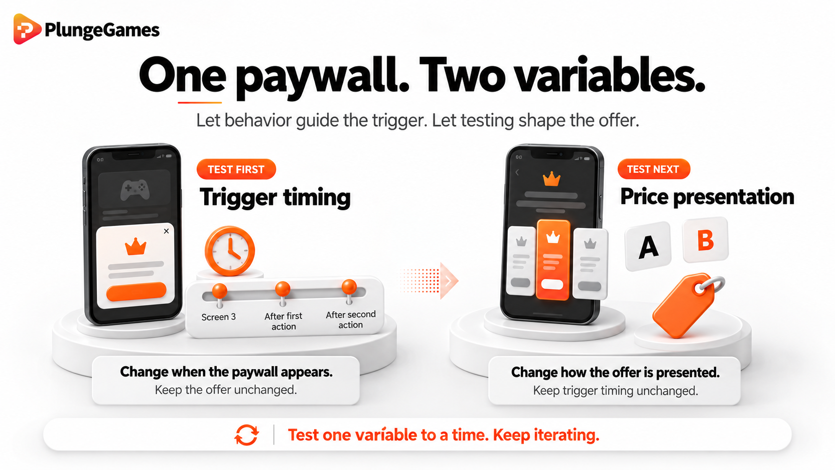
Optimizing this bottleneck requires decoupling the paywall into two distinct variables: Trigger timing and price presentation. You need to treat both as hypotheses, which means running continuous A/B testing.
1. Two types of trigger timing
A paywall introduced before a user understands your core loop generates drop-off, not revenue. Conversely, delaying the paywall too long allows users to form habit loops without ever encountering your value gate.
The optimal trigger moment occurs at one of two behavioral inflection points:
The Exploration Pivot: The exact point where a user masters the initial baseline mechanics and begins actively seeking the next tier of functionality.
The Progression Gate: The exposure point of a deeper retention mechanism. This is a step where advanced engagement, capacity expansion, or resource balance requires a commitment to proceed.
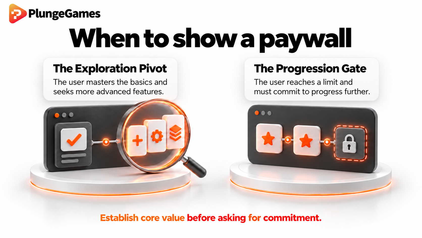
In gaming, either of these trigger moments is when the player exhausts their initial resource pool after understanding how to spend it. In a consumer app, it's the moment a user attempts to run a second automated workflow or save a second structured plan, after experiencing the value of the first.
2. Avoid discounting on the price presentation
A common failure in consumer app onboarding is displaying an immediate "special discount" or "flash sale" banner on the first paywall impression.
Discounting on day one destroys your pricing architecture. It anchors the user’s perceived value of the product artificially low, eroding purchase intent and neutering the conversion power of actual promotional campaigns later in the lifecycle.
Instead of leading with artificial urgency, present a structured value matrix:
Provide choice clarity: Offer up to 5 clear tiers/options with distinct value steps.
Anchor the benchmark: Position your middle option as the primary target, pricing it at or roughly 10% below your category benchmark. Higher tier options serve to anchor the perceived value of that middle sweet spot.
Never test a new paywall UI and a new trigger placement in the same cohort. Run isolated A/B tests on trigger timing first (e.g., screen 3 vs. post-first-action vs. post-second-action) to isolate when intent peaks. Once timing is optimized, run dedicated tests on price presentation and option tiering.
Sequencing value, or what gaming calls "The Hook"
Reducing time-to-value by 25-40% directly drives a 15-30% lift in activation rates. Because of this, standard growth advice preaches eliminating every screen between install and product usage.
However, in practice, I’ve seen that friction cannot always be stripped away.
If your core loop relies on algorithmic matching, intake quizzes are non-negotiable. If your product touches healthcare, payments, or security, mandatory account creation and multi-factor verification are legally required before a user can execute a single action.
Friction is never an absolute blocker if the user understands why it exists and what they get for finishing it.
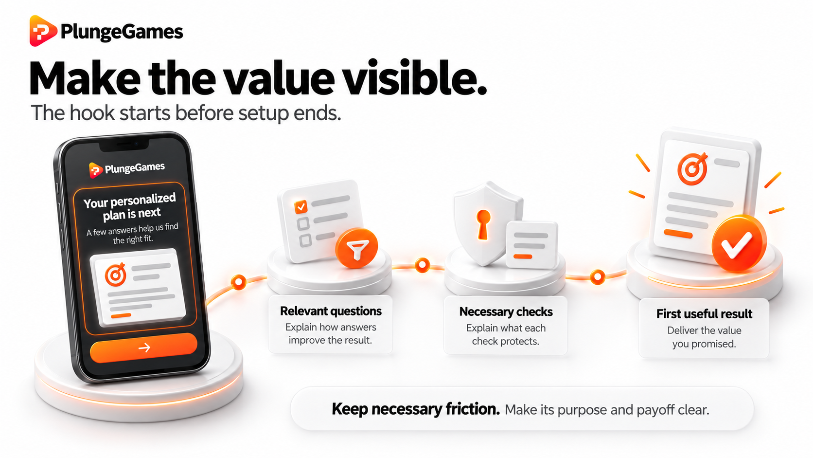
Contextual transparency explains the "why"
Users abandon intake forms because they feel like administrative overhead.
Gaming studios understand that players will tolerate complex setup steps as long as every input clearly impacts their starting gameplay. Consumer apps fail when they present intake steps as generic system prerequisites rather than explicit value builders:
Unjustified friction (high churn): "Answer these 8 questions to set up your profile."
Justified friction (high opt-in): "Answer these 8 questions so the matching engine can filter out invalid plans before your first session."
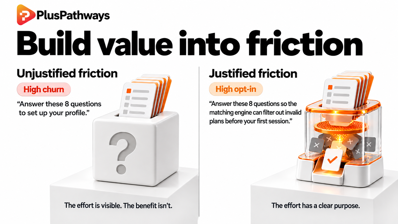
If a step is mandatory, your UI must explicitly state what calculation, output, or protection that specific input enables.
Goal clarity and milestone completion rewards
When an onboarding sequence extends beyond a simple sign-up screen, it must be engineered as an engaging path with a clear destination and an explicit reward.
In gaming, completing a tutorial or registration flow rewards the player with starting resources, an unlocked badge, or starter assets. Consumer apps often treat completion as its own reward. They expect users to feel satisfied simply because the form submitted successfully.
To decrease drop-off during longer registration flows:
Define the finish line: Show explicit progress visualizers (e.g., milestone steps, progress meters, or visual checkpoints) so the user always knows how close they are to completion.
Attach a completion prize: Offer a concrete, high-value asset immediately upon finishing setup. For example, an unlocked premium feature trial, a customized benchmark report, or starter balance credits.
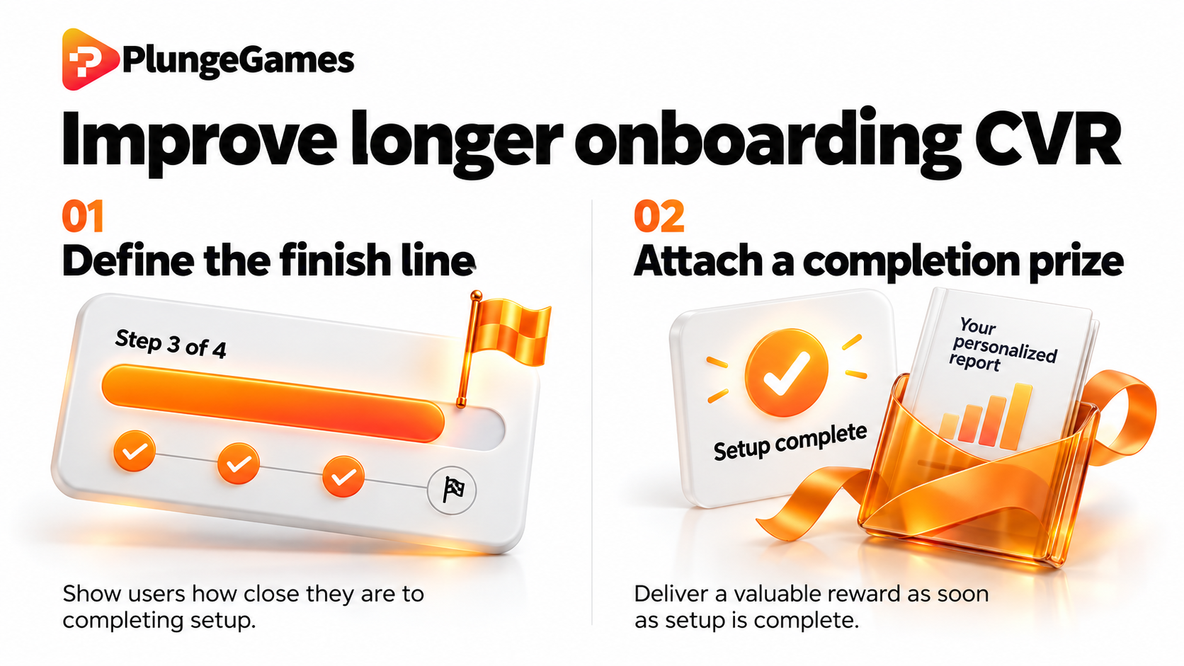
Making the registration process transparent, visually clear, and explicitly beneficial turns mandatory friction into an engaging first win.
Audit your setup funnel. If your sign-up or verification flow requires more than three screens, add an explicit completion milestone banner at the top of screen one: "Complete setup to instantly unlock your personalized 7-day action plan." Explicitly name the prize upfront so the user feels like they’re completing a goal.
Drop-off diagnosis: The instrumentation layer gaming takes for granted
Gaming studios don’t guess where users leave session one. They instrument every screen transition, tag every UI element, and review cohort-level drop-off funnels weekly.
While most consumer app analytics setups track three top-level events - Install, Signup, and Purchase - gaming teams log 15 to 20 granular events in the first session alone. The primary objective isn’t just measuring completion; it’s detecting the confused user.
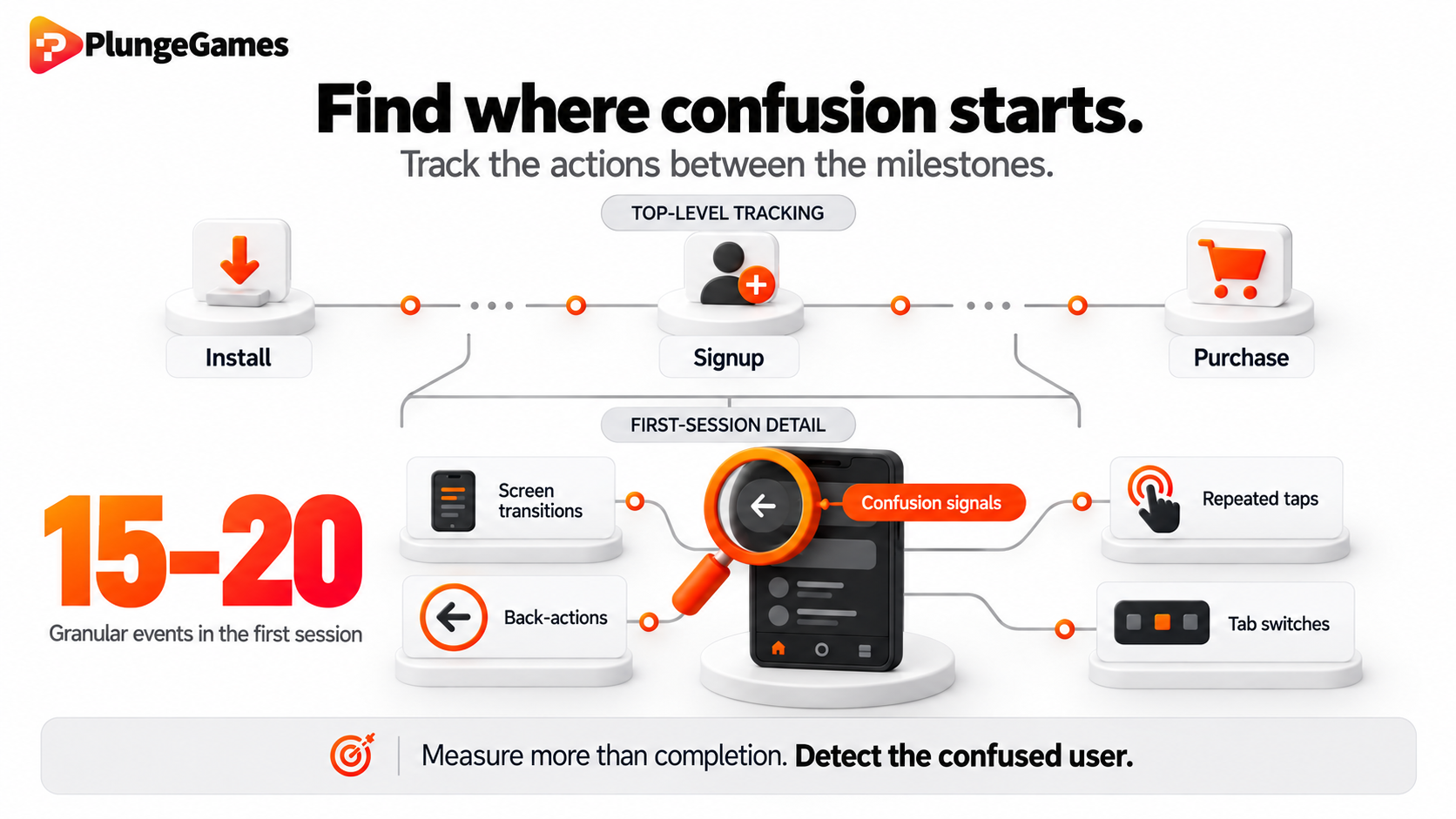
Detecting the off-track pivot
When a user encounters a poorly designed onboarding step, they rarely close the app immediately. Instead, they attempt to orient themselves: clicking non-interactive elements, toggling back-and-forth between setup screens, or abandoning the guided sequence to explore random tabs.
Track granular navigation behaviors, like erratic back actions, repeated clicks on peripheral elements, and tab-switching frequency during session one. This way, your growth team can pinpoint the exact moment a user gets off-track.
The "Slow Flow" paradox
Onboarding is the tool studios use to familiarize new users with the core loop. It explicitly shows them the single most effective path to derive maximum benefit from the product.
But when app teams try to impress users by immediately showing off every feature, integration, and menu section ("look at how much value we offer!"), they inadvertently invite off-track exploration. This triggers cognitive overload and degrades engagement.
Counterintuitively, apps can also end up enforcing a "slow flow". A slow flow refers to when an app deliberately restricts navigation choices and gates secondary features during the first session in order to accelerate time-to-value. By constraining the environment until users understand the core loop, they can achieve activation faster - leading directly to higher D1/D30 retention and stronger paywall conversion.
How you can start implementing a slow flow: Add event tracking for back_button_click frequency and tab_switch_pre_activation during your onboarding flow. If a cohort shows more than two back-clicks or attempts to switch main tabs before completing their first core-loop action, flag that screen as a clarity failure. Redesign the UI to remove secondary navigation paths until activation is logged.
What "Gaming-Grade" onboarding looks like in practice
"Gaming-grade" onboarding isn’t about gamification. It’s not about adding progress bars, animated badges, or daily streak counters to an application that doesn’t need them.
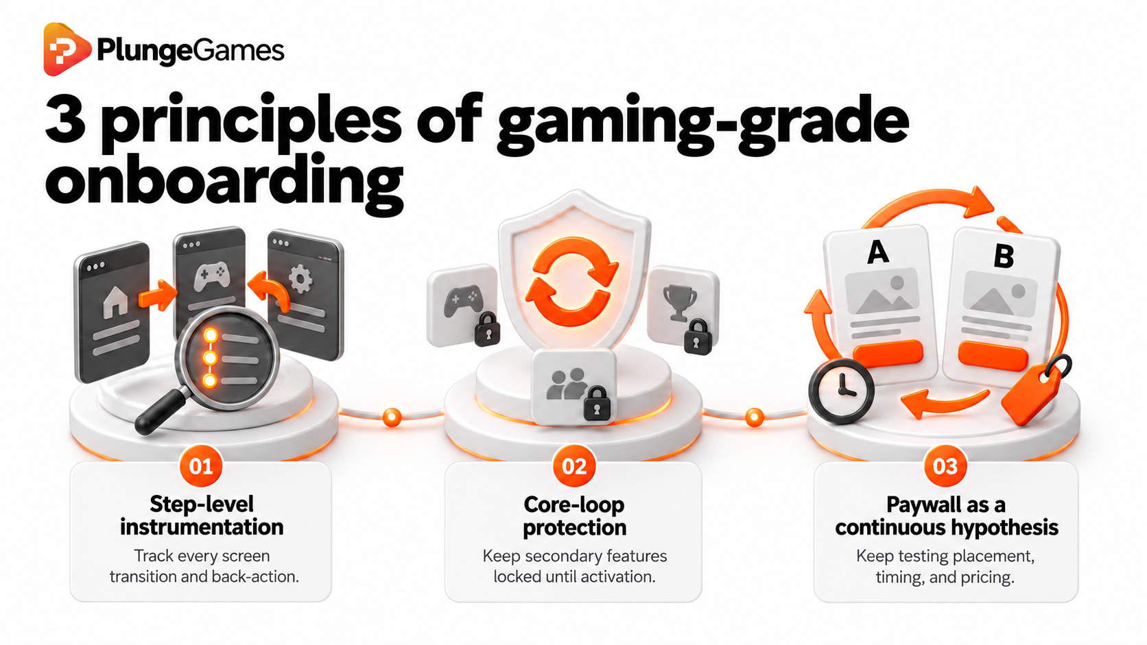
It’s a disciplined, data-driven approach built on three transferrable principles:
Step-level instrumentation: Every screen transition and back-action is measured.
Core-loop protection: Secondary features remain locked until activation.
Paywall as a continuous hypothesis: Placement, timing, and pricing are constantly tested.
The "Back to Basics" reset
For teams sitting on 20-25% Day-1 retention, incremental tweaks to button colors or copy will not solve the problem. You need to clear the board of all existing assumptions about how users interact with your application in session one.
Re-evaluating your onboarding flow requires auditing every screen against three non-negotiable questions:
Is this step functionally or legally mandatory? If not, remove it or move it post-activation.
Is it crystal clear to a brand-new user why this screen exists? If the utility isn't obvious within two seconds, fix the framing.
Does the user explicitly understand what value they gain by completing this step? If there isn’t a clear benefit or reward attached, expect drop-off.
Once you strip the sequence down to its essential core loop, re-instrument the new flow from scratch. Identify the new behavioral peaks and drop-off valleys, establish baseline metrics for your confused-user signals, and begin structured A/B testing on trigger timing and pricing options.
Losing the battle to win the war
The hardest mindset shift I see for product leaders is accepting that optimizing the first session often requires short-term tradeoffs.
Deferring account registration might decrease your top-of-funnel email capture rate by 15%. Locking secondary tabs might temporarily lower initial feature exploration metrics. Pushing a paywall past the first micro-win might mean fewer day-one trial starts.
In gaming, studios routinely accept lower top-of-funnel collection metrics because they know the math: a user who experiences true core-loop value in session one sticks around to convert at 3x the rate of a user who was forced through a high-friction setup.
You have to be willing to lose the short-term conversion battle to win the long-term retention war.
Build your FTUE playbook with Plunge
Gaming studios spent fifteen years and millions of dollars in burnt traffic learning how to solve the D1 retention bottleneck. Consumer app teams don’t need to repeat those expensive mistakes. The playbook for engineered onboarding, protected core loops, and instrumented activation funnels already exists.
Plunge partners with gaming and consumer app teams to audit, rebuild, and scale onboarding and activation engines using the exact, battle-tested frameworks that free-to-play studios rely on to hit top-quartile D30 retention and maximize lifetime value.
If your retention metrics have hit a ceiling or your trial conversion funnel is dropping users before they reach value, let's fix the machine. Get in touch with the Plunge team.